Tom Manchester
(Works at )
Luke Williams
(Lives in )
People near:
Lorem ipsum dolor sit amet, consectetur adipiscing elit, sunt in culpa quifdaasd quis.
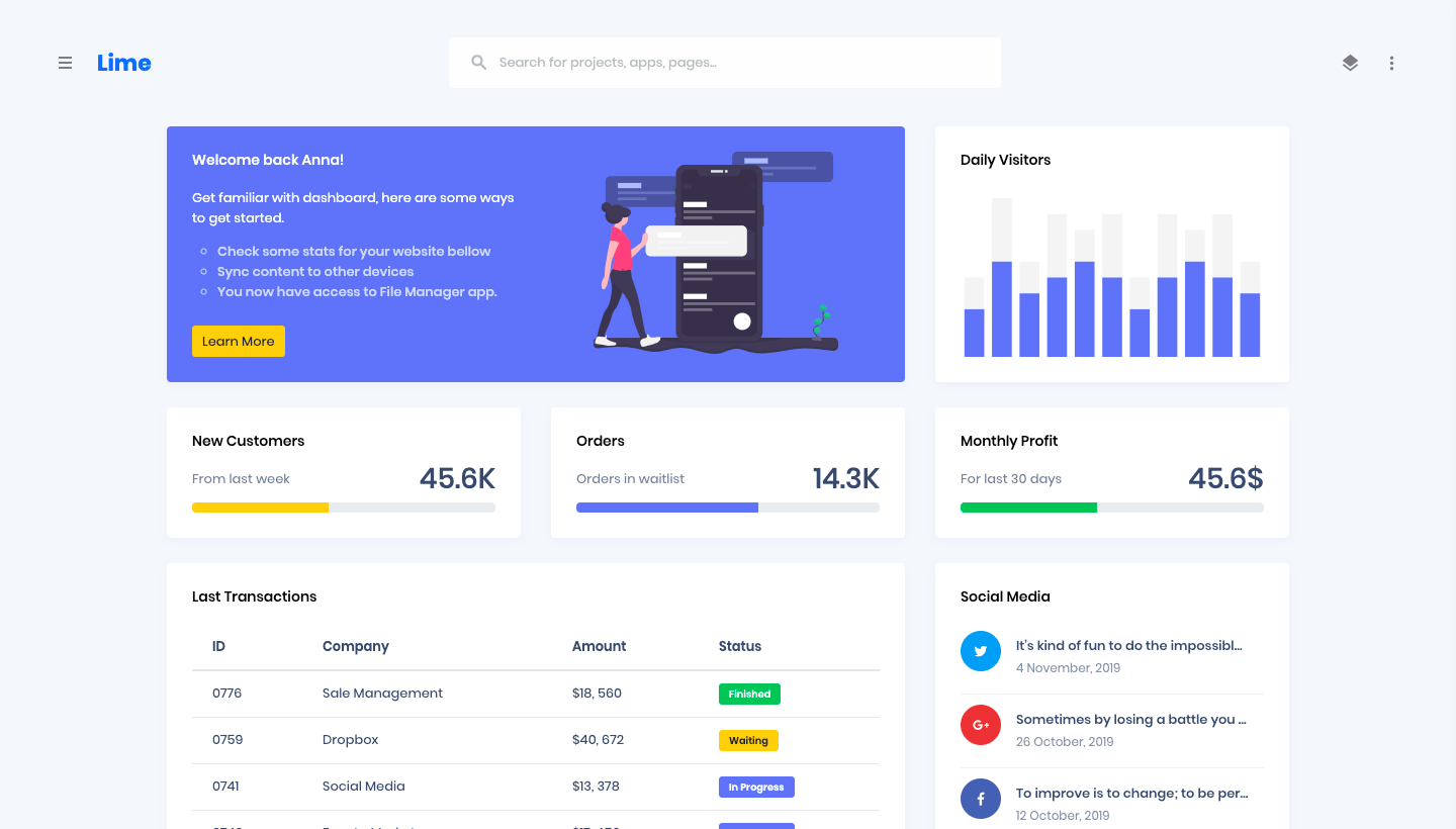
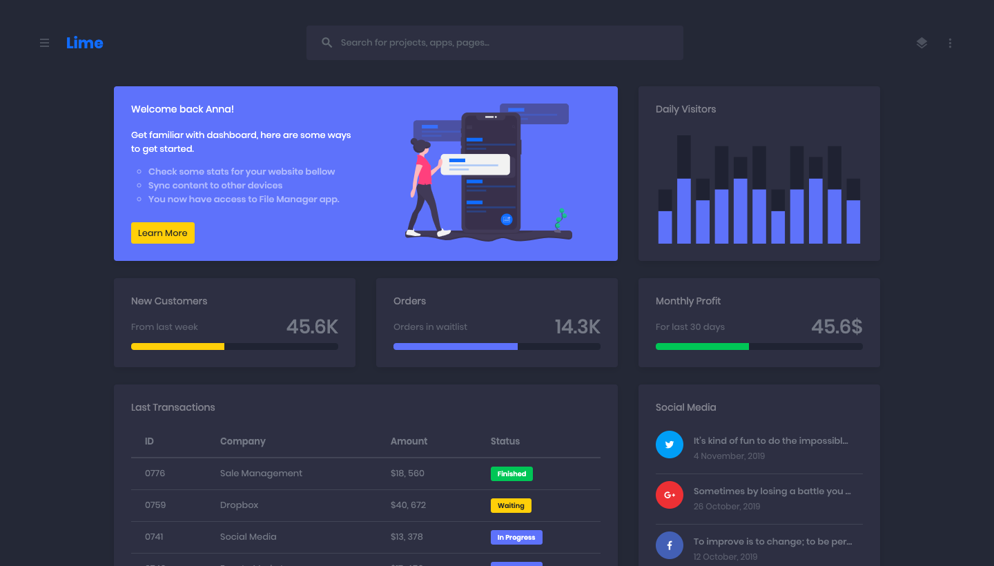
06 Dec, 2018Duis non semper sapien. Morbi imperdiet velit in bibendum lobortis. Integer arcu urna, elementum in pellentesque nec, finibus at nisi.
19 Nov, 2017Documentation and examples for using Bootstrap custom progress bars featuring support for stacked bars, animated backgrounds, and text labels.
Progress components are built with two HTML elements, some CSS to set the width, and a few attributes.
Add labels to your progress bars by placing text within the .progress-bar.
We only set a height value on the .progress, so if you change that value the inner .progress-bar will automatically resize accordingly.
Use background utility classes to change the appearance of individual progress bars.
Include multiple progress bars in a progress component if you need.
Add .progress-bar-striped to any .progress-bar to apply a stripe via CSS gradient over the progress bar’s background color.
The striped gradient can also be animated.